Showing posts with label exploring abstracts. Show all posts

Wednesday, May 1, 2019

abstract series... do you see mountains?

ignore the top falling off the design wall!
continuing the discussion of what I learned last week:
1. new ways to sketch from my online workshop
2. markers on printed black and cream fabric
3. quilting my abstract mountain piece
4. painting a background, or landscape
This is #3:

I essentially painted with fabric, not paint.
I approached a pile of scraps in an improvisational way. I danced with it. I sifted through it and moved pieces around on the table. I tried different angles.

After stitching it together, I then decided which angles worked in that section, and placing a ruler over the oddly shaped section I turned it into a block, the angles facing the way I wanted them in the finished larger piece.

All of it was fun, all let colors show up, dance, blend. Then it was time to add texture with the quilting stitch. This stops a lot of people.

Some people want it to be perfect. They like to plan.
I kind of see a blurry image in my mind's eye of how the finished piece looks. I un-spool threads and try to accent colors not match.

I like repetitive line. I know how my threads behave, which ones like which needles, and which tensions. I know which ones sink in and which ones sit more on the surface. I love Oliver Twist hand dyed cottons. they make a lovely blended organic color.
I started with them on the "mountain slope" that I saw in my mind. They blended in too much for me this time, so I switched to YLI metallic turquoise, and then to Madeira slightly bumpy metallic.
yes... I could see the line but it didn't distract.

I had to make the first larger quilt, then see the mountain images emerging. It looked like fractured seeing the landscape through broken glass windows to me. I hope that a viewer will see what they want in them though.

Why do abstracts? I used to predominantly make whimsical representational quilts. I still love the humor and approachability of them. I set off on a journey to learn what I could about abstract because I felt it lent a new element of connection between a viewer and I. I learned the principles of design by working this way. I learned more about my craft. And myself.

I trained in psychology and the visual connection between ink blots and abstracts wasn't lost on me!

So now I do representational pieces, but with a more abstract approach. I still love and make whimsical pieces that make me smile. I seldom make block quilts unless they have an element of discovery about them, like how certain colors mix. As I move along this road in my artistic journey I seek self expression. If I see an abstract painting in a gallery, I am only stopped by those that I can see something within. I still want to relate to art, and see the artist's self in a piece.
what do you think?
linking to
off the wall Fridays
can I get a whoop whoop Fridays  
Midweek makers wednesdays
Let's be social Wednesdays 

Tuesday, April 30, 2019

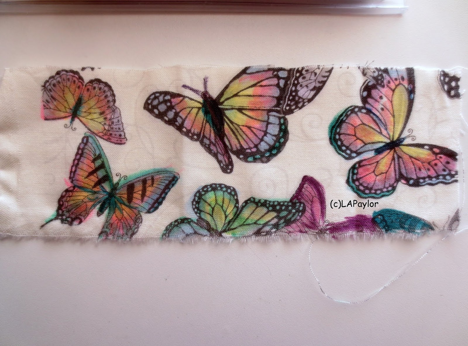
exploring abstracts... markers on fabric

last week I tried new things
1. new ways to sketch from my online workshop
2. markers on printed black and cream fabric
3. quilting my abstract mountain piece
4. painting a background, or landscape

This is #2
Markers on fabric.
Well I've applied color to fabric just about every way one can.
I used to lead a workshop adding color to fabric 12 ways, for quilters to experience different methods.

 I do love the control of markers
 I got this black and white print recently, knowing I wanted to try coloring. I've dyed black and white prints before, and painted them to look dyed. It's a lovely effect. But this came out really pretty.

I tried some markers that were too saturated, so they will be for words on fabric, or outlines, these pastel markers added the right amount of color, and blended well when overlapped.

Start with the lighter colors, then flick the marker a bit overlapping colors and they will blend on the fabric. It's a way to control where the color goes.

I paint, and prefer the serendipity of watercolors, feeling a little like the universe has a hand in the finished product. Pigment flows and blends sometimes, unplanned and beautiful. Acrylics on paper is harder, more immediate. You can mix colors but they tend to stay where you put them on paper. Oils stay suspended in the medium on canvas but take a long time to dry and smell.
I've enjoyed watercolor pencils, the color is a mix of pencil control and when wet will travel to blend.

I've used oil pastels on fabric, and they have a different look, as do inks used with a brush or marker.

It's all good, and all so much fun. Watching paint dry. Seeing colors appear. It's all good and you have to use the technique that works for your project, so it's good to experiment so you'll know when to use a certain medium.

Also it can be thrown away or repurposed if you don't like it.
I always like it! (eventually)
linking to

Esther's blog Wednesdays   
Midweek makers wednesdays

Sunday, April 28, 2019

sketching .... what do you see in this?


Some things I tried this week...continuing in my abstract mini-series
1. new ways to sketch from my online workshop
2. markers on printed black and cream fabric
3. quilting my abstract mountain piece
4. painting a background, or landscape

Today I'll talk about #1

My sketching workshop is very good but I didn't realize the lessons would be daily. It's a lot to keep up with, a lot of new techniques all at once. I did day one and part of day two but we're on day 5 now.

So in day one, we were to do a continuous line drawing of our face, never looking at the paper or our face (that is the smaller top one on the right). Pen touches paper, the opposite fingers touch your nose, as you move your left finger around your face, your pen moves around the paper.

Then we did it by looking in a mirror but not the paper, still continuous line.(next one down)
 Then glancing at the paper.(ugly top left)
I like the more Picasso looking ones but not lifting your pen is hard!!

 The next exercise was to take pics of sidewalk cracks and look into them like an abstract painting... what do you see?
Print the image then really see it, look for an image and draw what you see.
I saw a profile of a man. Then after taking this picture
and of course it depends on the angle you look at it, the angle you take the picture, I saw a

fish swimming
My process was to take the printer copy, turn it all around, and find what I could in the image. Then trace the lines with a sharpie marker on the paper.
what do you see here?

I saw my favorite one of all!

Very Leonardo da Vinci, no?

Again, the purpose is not to paint the great American painting, it's to experience something new, to learn to control your hands and paints, to see things a bit differently.

I started the next day's work, drawing little houses on a hill but I'm not that good!
Each day there are two talented artist videos presenting a new way to look at the world.
The link to the free workshop is:
https://www.karenabend.com/sketchbook-revival-2019/


Friday, April 26, 2019

what do you see in this? Abstracts and experiments

while paint dries...
Some things I tried this week...
1. new ways to sketch from my online workshop
2. markers on printed black and cream fabric
3. quilting my abstract mountain piece
4. painting a background, or landscape


All were influenced by what I see around me daily, the scenes, the colors the way the air feels etc.
All involved seeing the world with fresh perspective, and looking into something abstract to find images I could relate to. 

I'm so excited about all four, and there are lots of pictures, so I plan to write a four part series, with posts on each process. Stay tuned my friends, share the fun with me!

So for today, #4...

During a heat wave on Tuesday, I found myself wanting to paint some fabric. I tore a large quarter yard off of some PFD white fabric, got a piece of freezer paper and some SETA-Shimmer paints to do a landscape. I also used dynaflow paint, and some spritzer paint. All made for use with textiles, all in an acrylic base but behave like watercolors on paper. This time I used a sponge brush not a sponge.

I went outside to the patio, as I wanted to try sun printing with the oranges mesh bag for texture on a background piece.

I balled up the fabric after wetting it totally, squeezed it out, spread it out long ways on the table outside, and started by spritzing with turquoise paint a friend gave me. Then daubed on seta shimmer in canary, and electric blue (shimmers have a lot of pigment and a delicious sparkle). I chose not to dilute them further, just to see how much they would blend on really wet fabric.

The pigment did not want to travel like usual on the wet fabric. I've painted so much on all media but never had it mostly sit still where I drop it.

I spritzed it again, and put the netting from oranges on to see if it would sun print a texture.
Nope, no traveling or mixing of colors no sun printing. I spritzed again, and dragged the pointed edge of the foam brush through the colors to lead the colors in blending.

Hmph! So I stretched it out, spritzed the still white areas, and using small bottles of dynaflow dropped purple, pink, crimson on that hoping for a sunset look.The dynaflow did start to migrate. As the paint moved and I watched, I hoped for a sunset kind of feel to the piece but it looked more and more like red cliffs of a mountain against new green of spring.

That's okay too!
So the lesson here was to see what emerged, not direct the show. Okay. I continued to watch the pigment move blend, connect and to imagine what scene was developing.

This became a theme for the week's experiments!
I didn't love the way it was drying so quickly, and like many projects, the self-censor began to grouse in my mind, "another waste of materials!" and "this just looks like nothing!" Know that voice?

However, I also know it ain't over til it's been overworked! I hung it up vertically to totally dry while I did other things. I looked at it as I put away dishes, came and went, did other things. I realized I might see something totally different that I aimed for. I realized I could stamp spirals over the pink areas and they would be tall standing flowers in front of a mountain. They even engaged the border which I forget to do.
what do you see in this?
It's the difference in a planned painting, where the scene is in the middle of the fabric, intact, or part of it is cut off so your mind's eye has to know the rest of the flower is still there, but not in the picture. Cropping in a way, although this was made like that. Cropping an image lends interest, as the viewer must engage with their vision to complete the image.

So I now saw a foreground tall blossomed set of flowers, mountains in the background... I could stencil little incomplete flowers in pale purple,

 I could stamp spirals, all lending to a texture that felt like blossoms. I could stitch in the blossoms with thread. I could use markers or colored pencils. What if a tiny bird hid under the tall flowers?
Like Michangelo said, "I am always learning"
see the sparkles? Do you see a landscape scene?
the point is not to paint something to sell, the point is to look at the world in a new way.

So I'm going to turn it all around, consider my next steps. I could crop it into four smaller paintings or most likely will do something to look like the foreground flowers. I like the idea of stenciling some petal shapes, then stamping spirals over that. 


I think the best thing is to learn by doing. Try it. Like dancing, turn off the censor within, and just move. Like listening to another language being sung, just let the sound carry you along undisturbed by actual words. Then turn it around and look at it a new way, you will be surprised at what you see.

It's exciting!
(remember I'll be doing four posts in this series, next one will be on Sunday)

Linking to:
off the wall Fridays
can I get a whoop whoop Fridays 
https://paintpartyfriday.blogspot.com/