For this week's painting round up, the focus is on learning... doing things differently but as always enjoying color!
I am taking two intensive workshops with 3-4 hourlong videos each this week. It's sad when good things overlap and a person has to make a choice of what to leave behind. I started a lot of paintings this week, and hope to get to them later but a few things were made.
the owl seemed plain til I thought to add in mice! The cut out word was done on an index card, then cut into a leaf shape, a calligraphy word and some leaf drawings then taped to the piece, sitting on the mantel now
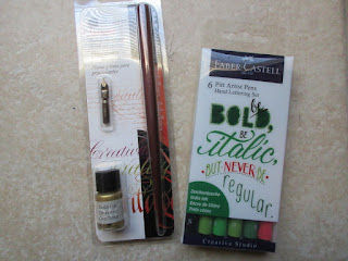 |
| new pens!!! |
speaking of calligraphy I'm signed up to take a free workshop next week and tried my new brush pens. I like them a lot!
the workshop this week, CreativeU asks each presenter what color they usually leave off their work.
I like all colors, except beige...and although I enjoy vibrant hues and saturated color, I am finding a use for the quiet, neutral colors where there is less contrast. It seems to be peaceful and allow the viewer to complete the picture.
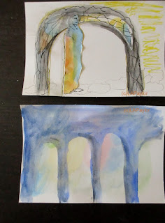
one presentation on illustration, said to paint with a watercolor back ground in all colors, then paint over the negative space...
I painted two backgrounds, then in darker colors the negative space leaving the pretty colors to become the image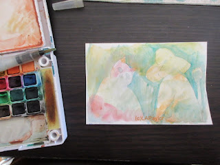
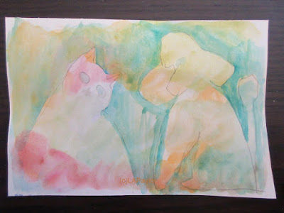 |
| next time paint darker color around the images |
the top index card is the leftover from cutting out the fall leaf at the top of this post. I glued them to the card, and painted around the bits...
Kind of amazing that trash can become more...
since I can't really share the starts to lots of projects, I'll show you the last one. I do a lot of female portraits, and have developed my way of starting them. This presentation from Willowing's Life Book taster sessions, had a different approach. Just start laying in blobs of color... made me uncomfortable and I don't like it but...they don't all work, and there is beauty in all
dh's reaction wasn't positive... "your other portraits are a lot better" he said. I know, but it's a different approach. I'm using a new paper to me, Dick Blick brand 90 lb watercolor paper. Very inexpensive for learning on, don't worry about wasting it, but it absorbs the paint like crazy. The colors dry to paleness.
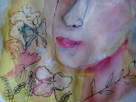 |
| colors are much more intense in real life the photos are washed out |
I think her technique deserves more attempts later, and like the quick line drawings done in staedtler black ink pen.
More videos today, can't keep up but I can try....
linking to: face off party!
Gillena(lunch break) of art


